Since I posted How's It Goin'?, here's part of a planned online comic I made in the same year using the same character.
This first part was an intro piece and interface design to select separate stories:
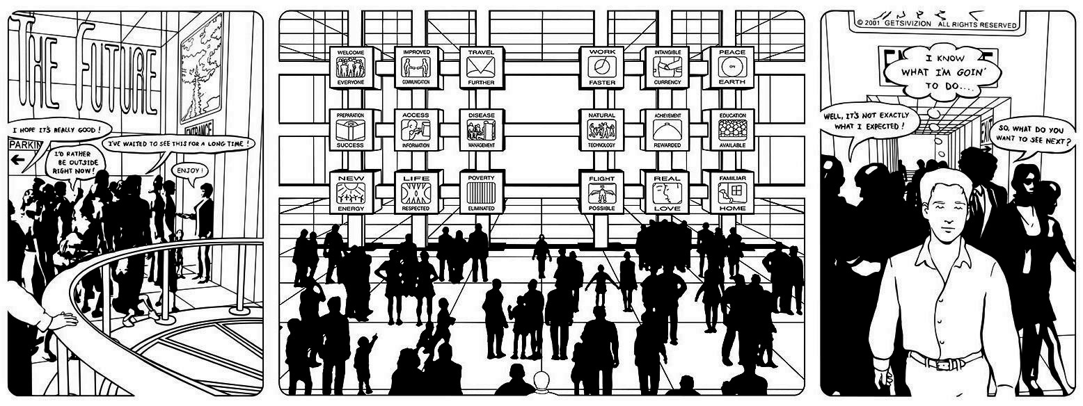
(click on the image for larger version)
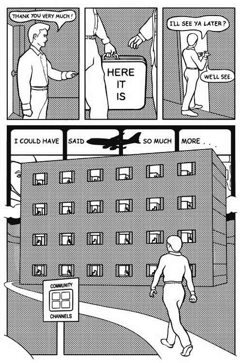
and here's the only story I completed for the series:
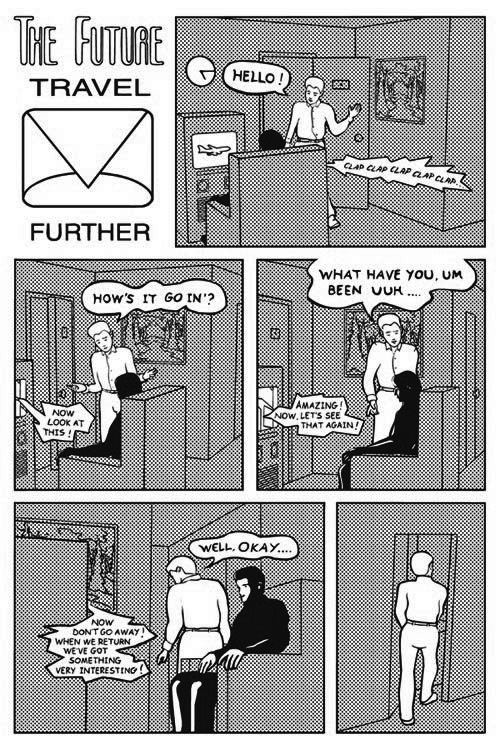
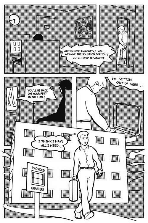
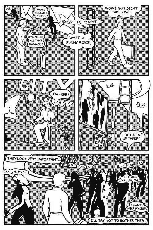
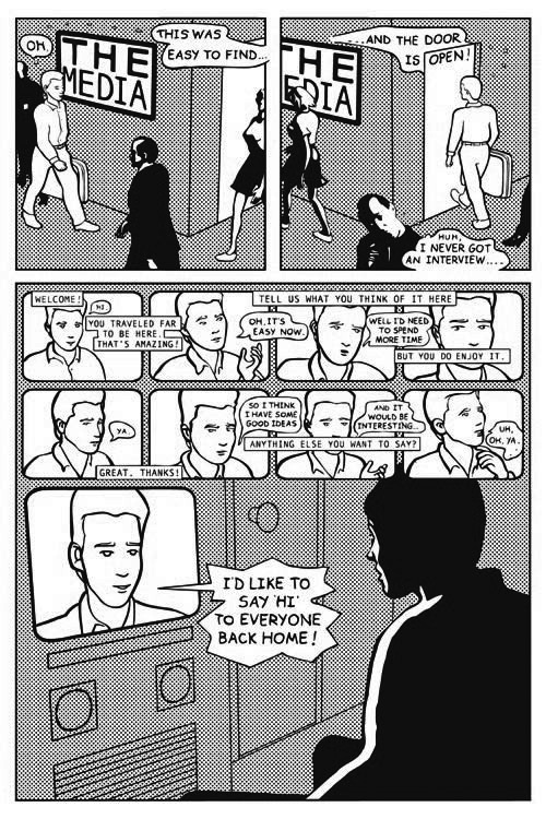
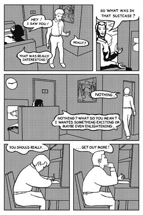
(NOTE: This comic was featured on Arthur Magazine's comics blog on September 13th, 2010. Thanks to editor Jason Leivian of Floating World Comics.)
Check the comments for a sampling of some feedback about these comics that I saved from the now deleted threads which were on The Comics Journal messageboard:
Check the comments for a sampling of some feedback about these comics that I saved from the now deleted threads which were on The Comics Journal messageboard:
"Your piece is really good. It's got that weird 'Getsiverse' feeling where people speak in ideas rather than thoughts, plus some really interesting design and page use."
ReplyDelete"Huh? Not crazy about. Interesting effects on people in first story. Gimmicky."
"Hmm. I'm not so sure what's going on here? I feel like the people in the last panel.. What might have been cool is if those panels set into the grid acted as a narrative inlay. Or is that what you're going for?"
"I liked "The Future" a great deal; it was well-drawn and punctual in its "get in/tell the story/get out" efficiency. I wonder what a longer piece by Mr. Getsiv would look like?"
"I love watching you experiment. Whoever taught you must be some kind of genius or something." (This comment was written by one of my teachers.)
"Interesting weirdness. Great compositions in the first story. (Marred only by the out of place looking gigolo type on the last page.)"
""Future": Short and sweet, like your previous one."
"I liked “The Future.” What part of that is computer and how much of it did you draw? I have a sneaking suspicion it’s not as much as I think, in which case I’m impressed."
ReplyDelete"You are a weirdo-- in a good way! Weird stuff there, but I love it."
"Loved the silhouette look you give all the figures in the first piece, starkly contrasting against the white background."
"The Future was one of the most effective meldings of drawn and 'putered stuff in the book. That font that was used on the last page was pretty bad though. Personal taste I suppose, but *shudder*..."
"The Future - I don't really get it - a satire on superficial get yourself sorted out schemes? The silhouetted characters seem like they have been cut and pasted from somewhere else; were they?" (Answer: No.)
"I like Mike Getsiv's stuff. A lesson to us all. Interesting use of lettra set on everything."
"Total pop art, man! I dig it!"
"Exactly why you elected to create a comic about the last two years of my life I cannot imagine."
ReplyDelete"Okay, it’s interesting and, I guess, innovative, and maybe some other high-falutin words I’m too dense to come up with, but the one that comes to mind is ‘yuck!’ What are they, robots? (Maybe it’s the white pupils. Are they blind? Stoned? Out of ink?) Call me a philistine (please!) but it couldn’t have left me colder."
"I love a lot of your other stuff, as you know, especially Eyeballs and the piece in Swell, but this one I just didn't quite get, even after reading it a couple of times through. And I kind of see your formal point with the dot screens, but it makes the story a bit hard to get into..."
"Getsiv, again, what can I say. Very different to Eyeballs, but still very therapeutic. I like the what do you call it, the technical illustration style."
"I feel like I've seen this thing your working on, this structure of "Futurevision" -or whatever you call it- really begin to emerge from the various spots I've seen it in. I know you aren't looking for warmth, but there is more weight and give to your figures, which I think ups the dissonance with the rest of the-- um, I'd use the word "superflat" except that's already taken and now doesn't mean what I want it to mean-- linework (backgrounds, etc.). The fat blacks of the other figures and the stretched and distorted parts really punch it home. Separation, alienation, the mechanical/instructional comics vibe, de-juxtaposed panel transitions, balloon placements, All of it really pushing on the reader. Great vibe!"
"Those zip-a-tone dots hurt my eyes. In a good way."
"Loved the dots all across everything, I bet there’s a technical term for it that I show my ignorance of. In the second panel I thought he was asking how it went in rather than how’s it goin’. I liked the story, the bit about the suitcase was well judged. The pay off line, was it a comment on the pair of them? In that he went out just to get on telly and say hi to his room mate? I mean, that’s pretty mental too, in it’s own way."
I first read this comic a long time ago. It makes more sense now (and I like it more). Thank you so much for posting the comments! Especially the negative ones! It is so interesting and funny to read what people don't like. And why! The more I read it the more I like it as a whole - the 'Technical Illustration' style, the two tones (more specifically what is black and what is white), the layout (the panels as tv and the panels in the sky in transit), the humor (Tony Manero as inspiration for the lead character), and also the concepts of what the future may look like (I feel like the guy in the chair looking at the screen because as I write this ... I'm sitting in a chair looking at a screen). So yea! The Future! I wish more people had visions of the future like this (that we could learn important lessons about ourselves in gentle ways).
ReplyDeleteOK Mike, I'm hooked! I want more of "The Future"! I figured the whole 'code' thing out ... 'Travel Further' is only one "episode" (for lack of a better word) in the Bigger Picture which is "The Future" (the thing on display in the middle panel of the intro piece). I don't know why you didn't start with 'Welcome Everyone', but I don't think jumping to 'Travel Further' spoiled anything for me. I can't wait for 'Natural Technology' or 'Intangible Currency'! I like how you grouped the ones on the left and then the ones on the right. Is this in a book yet? I'd kinda like to read it in it's natural flow climaxing with 'Real Love' and ending with 'Familiar Home'. Nice planning. Nice future mike, when does it get here?
ReplyDeleteThanks to both of you clones.
ReplyDeleteThe Future is coming soon...
I loved it. :)
ReplyDeleteThanks Mai!
ReplyDelete